Introduction to Wes Anderson Colors in Gemstones
Colors tell a profound story before a single word is ever spoken. In cinema, color sets the mood and guides the audience’s emotional journey through a scene. Similarly, colored gemstones communicate beauty, rarity, and cultural meaning through their unique shades. Therefore, filmmakers and jewelry designers share a creative language built entirely on visual impact. Specifically, the use of Wes Anderson colors in gemstones offers a new way for designers to narrate luxury through pastels, symmetry, and nostalgia.
Indeed, American filmmaker Wes Anderson crafts every single frame with meticulous care. He uses balanced compositions and highly curated palettes to build a distinctive, dreamlike atmosphere. Likewise, jewelry designers know that every gemstone shade shapes how a buyer perceives a piece. Although cinema and jewelry belong to different fields, both use color to tell stories that resonate emotionally. Consequently, Indian jewelry designers can draw inspiration from this cinematic approach. Instead of chasing pure status, they can create meaningful experiences for everyday buyers who shop for sentiment. Readers can explore gemstone identification basics through our Gemology section and learn more about Anderson’s films through the official Searchlight Pictures website.
Narrative Impact of Wes Anderson Colors in Gemstones
First, both the filmmaker and the gemologist treat color as a primary language. Anderson plans every wall, costume, and prop as part of one unified composition. As a result, viewers sense a scene’s mood—whether it is whimsical or melancholy—before the characters interact. Similarly, jewelry designers combine gemstones that complement rather than compete with each other.
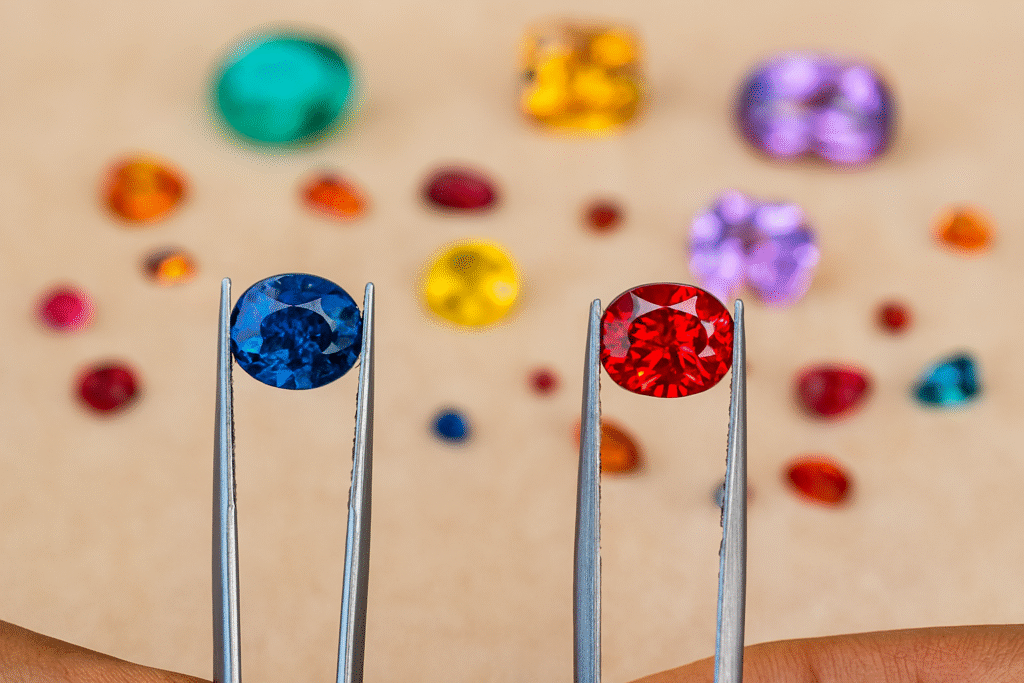
A vibrant ruby, a calming sapphire, or a fresh emerald each stirs a different human feeling. Therefore, customers often connect with a gemstone’s “vibe” before they ever learn its technical market value. Furthermore, warm colors like citrine often energize buyers, while cool colors like aquamarine calm them. By adopting Wes Anderson colors in gemstones, designers can move away from traditional high-contrast pairings and toward more nuanced, tonal storytelling. This shift is essential for building India’s global brands in the high-fashion jewelry sector.
Design Harmony and Wes Anderson Colors in Gemstones
Next, both cinema and gemstone jewelry share a disciplined structural foundation. Interior designers often apply the “60:30:10 rule.” This involves choosing one dominant color to set the mood (60%), a secondary color to add balance (30%), and a small accent to create visual interest (10%). Notably, Anderson’s frames often follow this exact balance, so every shot feels intentional.
Likewise, jewelry designers arrange gemstones using this geometric logic. For example, a modern necklace may pair green tourmaline (60%) with bright diamonds (30%) and a sharp black onyx (10%) as a bold accent. Moreover, successful collection designers repeat these chosen colors across multiple pieces. This consistency ensures the finished jewelry looks elegant rather than cluttered. This level of oversight is maintained by the industry sheepdogs in tech and jewelry who protect design integrity globally.
Cinematic Guides for Wes Anderson Colors in Gemstones
Furthermore, several of Anderson’s most famous films invite a direct visual comparison with specific gemstone groups. These palettes help us categorize the emotional weight of different minerals.
The Grand Budapest Hotel: Kunzite and Morganite
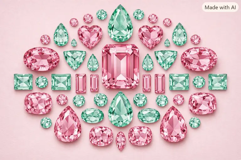
This film showcases soft, “candy” pinks and purples that recall the beauty of kunzite and morganite. These stones carry a feminine, whimsical energy. By using these Wes Anderson colors in gemstones, a designer creates a sense of romantic nostalgia that appeals to Millennial and Gen Z buyers who value buying emotional value in India.
Blue Tones in Wes Anderson Colors in Gemstones
In contrast, The Darjeeling Limited leans heavily on deep blues and saffron oranges. These tones echo the combination of fine sapphire and high-purity yellow gold. The palette evokes a sense of travel and spiritual discovery. For Indian designers, this connection is especially relevant when working with Sanskrit gem knowledge and ancient trade traditions.
Earthy Shades in Wes Anderson Colors in Gemstones
Moonrise Kingdom embraces golden ochres and mustard yellows that perfectly resemble citrine and yellow topaz. These colors suggest summer adventures and youthful optimism. By framing stones in these earthy, saturated tones, jewelers can tell a story of resilience and warmth. To understand the science of these shades, visit the Gemological Institute of America (GIA).
Showroom Tips for Wes Anderson Colors in Gemstones
Moreover, Indian jewelry retailers can apply this cinematic thinking to their physical showroom design. Traditionally, many Indian stores rely on harsh white lighting and crowded display cases. This can often overwhelm visitors. Instead, retailers can build calm, color-themed spaces with balanced, symmetrical layouts.
Showing rough gemstones alongside photographs of artisans at work helps customers appreciate the craftsmanship. This level of transparency is a core lesson in the world’s oldest company lessons for Keralam, where the story of the maker builds long-term trust. When you use Wes Anderson colors in gemstones to decorate your space, you create a recognizable brand universe that shoppers want to inhabit.
FAQ About Wes Anderson Colors in Gemstones
How do I choose a gemstone palette for a new collection?
You should start with a specific emotion or a reference image from a film. Use the 60:30:10 rule to ensure your stones don’t clash, and always check the color behavior under different lighting.
Why is symmetry so important in this aesthetic?
The human brain finds symmetry inherently calming and professional. Symmetrical designs suggest that the jeweler has complete control over the materials, which increases the perceived value of the piece.
Can I use affordable stones to achieve a cinematic look?
Yes, absolutely. You can use semi-precious stones like amethyst, citrine, and peridot to create vivid palettes. As discussed in our steel jewellery buying guide, the design and color often matter more than the raw material cost for fashion-forward buyers.
Does the “Wes Anderson look” work for traditional Indian weddings?
Indeed, it does. Many modern brides are moving away from heavy red and gold toward pastel “floral” themes. Using Wes Anderson colors in gemstones like pink sapphires and mint-green emeralds fits this contemporary bridal trend perfectly.
Where can I learn more about color theory in jewelry?
You can take specialized courses at design institutes or study the grading reports of colored stones, which explain how “hue, tone, and saturation” create the final visual effect.
Disclaimer
This article presents creative comparisons for educational and design purposes. The author has no financial affiliation with Wes Anderson or Searchlight Pictures. Gemstone symbolic meanings vary by culture. Always consult a certified gemologist for stone identification and appraisal. Data reflects design trends as of August 2026.