Summary
Pantone selected Cloud Dancer (11-4201) as the Color of the Year 2026. It is a clean white that reflects calm, balance, and a return to clarity. Designers can use it across fashion, interiors, jewelry, and digital products. Jewelers will find it in moonstone, akoya pearls, South Sea pearls, soft gray spinel, matte-finished gold, and very light brown diamonds. This story explains the shade, its meaning, and its real-world use with direct links for sourcing and design reference.
Introduction: Pantone Color of the Year 2026 Cloud Dancer
Pantone surprised the design world by naming Cloud Dancer as the 2026 Color of the Year. In fact, after years of deeper tones, Pantone moved toward a shade that feels open and clear. Cloud Dancer sets a quiet base. You see space instead of noise. You also see the start of a new direction.
The choice marks the first time Pantone has picked a white for this program. That shift reflects the need for a pause in an overstimulated world. Laurie Pressman of the Pantone Color Institute™ described Cloud Dancer as a grounding tone that gives support to surrounding colors. Her view aligns with a broader trend. People want less clutter. They want ease. Next, they want a surface where thoughts can settle.
In addition, Cloud Dancer offers that sense of rest while still shaping every palette around it.
What Pantone Color of the Year 2026 Cloud Dancer Represents
Pantone framed Cloud Dancer as a sign of quiet renewal. In fact, the shade strips away visual weight and opens room for thought. You step into a space where you can reflect and reset. You slow down before moving forward.
Pantone also pointed to the ongoing contrast between digital speed and human connection. Screens compete for attention. Cloud Dancer responds by offering a visual pause. It signals a cleaner path. Therefore, you return to your own rhythm.
This shift mirrors what many people want today. They seek clarity, not overload. Therefore, Cloud Dancer supports that search by giving the eye and mind a moment to breathe.
Pantone Color of the Year 2026 Cloud Dancer in Design
Designers across fields can apply Cloud Dancer in different ways. In fact, in fashion, the shade works with linen, silk, cotton, and wool. When paired with deeper colors, it defines shape. When matched with softer tones, it forms a calm field that holds the entire look together.
Interior designers can use Cloud Dancer to open small rooms or lighten darker corners. Under warm lighting, the shade leans toward cream. Under cooler lighting, it feels airy. That range makes the color practical across homes, hotels, studios, and retail spaces.
Graphic designers can use Cloud Dancer to sharpen layouts. The shade supports clear spacing and controlled contrast. In fact, when paired with saturated accents, Cloud Dancer highlights every element without taking over.
Pantone offers full palettes for Cloud Dancer inside Pantone Connect. You can explore the combinations directly on Pantone Connect.
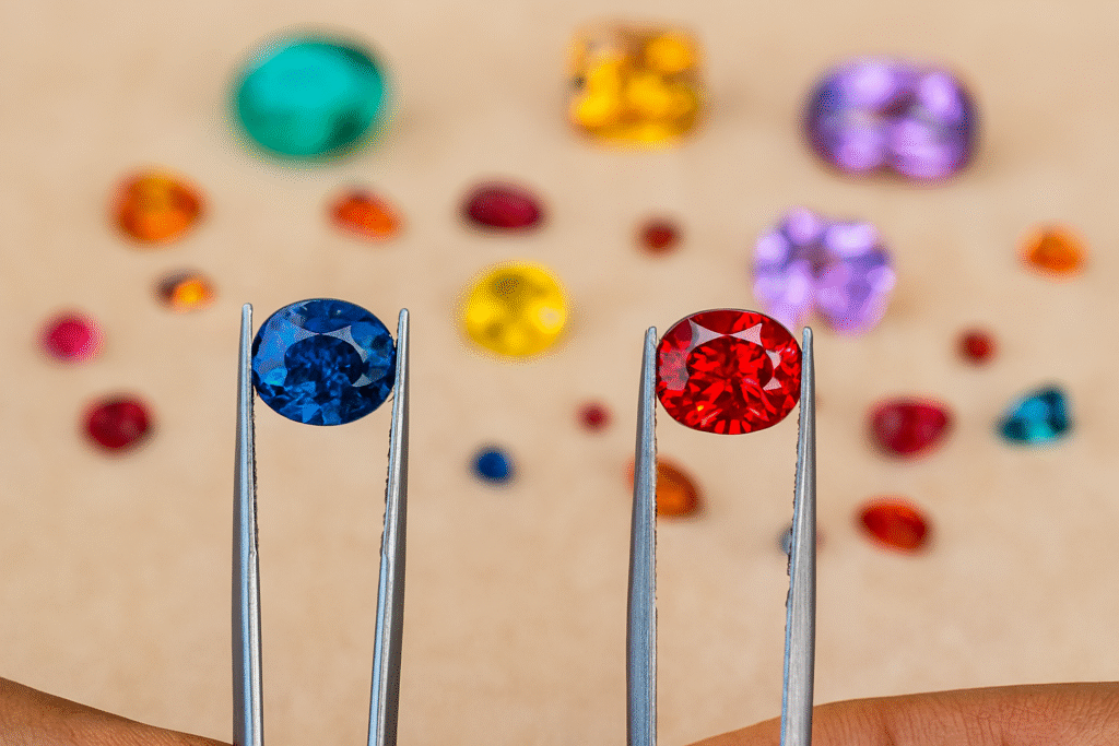
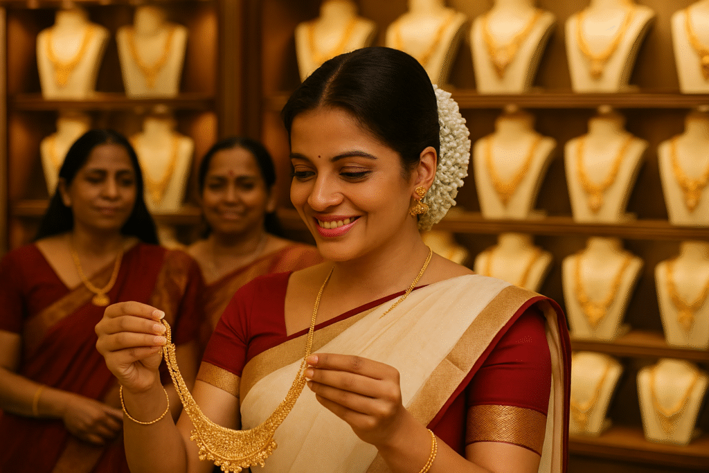
Pantone Cloud Dancer in Jewelry and Gemstones
Cloud Dancer appears naturally in several gemstones. For example, pearls and moonstone show a soft glow that pairs well with the shade. For readers who want more detail on pearls, see: Saltwater vs Freshwater Pearls: Why They’re Not the Same
In fact, jewelers can also turn to akoya pearls and South Sea pearls. These pearls fall close to the Cloud Dancer tone and work in both classic and contemporary designs. For example, when set in yellow gold, they create subtle warmth. In addition, when placed in platinum, they become crisp and clear.
Additionally, soft gray spinel strengthens the contrast. Matte-finished gold gives depth without pulling attention away from the center stone. Very light brown diamonds add low-intensity color that enriches the entire palette. These combinations fit naturally into displays built around Cloud Dancer.
Readers interested in pearl guides and gemstone buying notes can explore Paspaley Strand Craftsmanship | Timeless Treasure
Why Pantone Color of the Year 2026 Cloud Dancer Is White
Pantone often picks bold shades. Cloud Dancer takes the opposite route. That change reflects a global desire for calm and clarity. People want fewer layers. They want simple forms. They want a surface where ideas can grow.
Cloud Dancer also adapts to every commercial field. Fashion houses can weave it into seasonal lines. Home décor brands can use it for textiles, paints, and furnishings. Digital design teams can place it inside interfaces. Because the shade holds many roles, it supports wide adoption without limiting creative direction.
Laurie Pressman noted that Cloud Dancer gives structure to the color spectrum. She explained that it helps other colors shine. That insight shows why the shade works so well. You are free to use bold accents while keeping a stable base.
For reference, you can view Design With Pantone Color of the Year 2026.
Practical Ways to Use Pantone Color of the Year 2026 Cloud Dancer
If you design jewelry, you can build small groups around moonstone, pearls, or pale diamonds. Additionally, the shade works well as a tray color, display background, or photography surface.
For example, if you design interiors, you can apply Cloud Dancer to walls, trims, or furniture. Textures like wood, stone, and woven fabrics pair cleanly with it. Because Cloud Dancer supports contrast, you can add accent colors without losing balance.
If you work in digital design, you can apply Cloud Dancer to interface elements, margins, button backgrounds, or landing pages. The shade sharpens icons and typography while keeping a calm layout.
You can also weave Cloud Dancer into brand storytelling. In fact, when you want to signal a new phase, a white tone like this marks a clean beginning. It reflects a shift toward openness and clarity.
To see more jewelry design and creation stories, read AI for Jewelry Design and Creation.
FAQ
Why did Pantone choose Cloud Dancer?
Pantone wanted a shade that reflects clarity, balance, and reset. In fact, Cloud Dancer meets those needs and adapts across industries.
Does Cloud Dancer appear in gemstones?
Yes. You can see it in white moonstone, akoya pearls, and South Sea pearls.
Can designers use Cloud Dancer in digital work?
Yes. The shade supports clear layouts and strong contrast.
Is Cloud Dancer warm or cool?
Light controls the tone. Warm light softens it. Additionally, cool light makes it feel lighter.
Credit
This article draws on reporting first published by Pantone. Credit to Laurie Pressman, Vice President, Pantone Color Institute™, for sharing “Design With Pantone Color of the Year 2026.” The story is adapted from Pantone, the global authority on color and the creator of the Pantone Matching System (PMS), a color system used across design, fashion, and manufacturing. The text includes added SEO research and contextual updates by Saju Elizamma to support readers who follow color trends, jewelry updates, and design direction.